Back
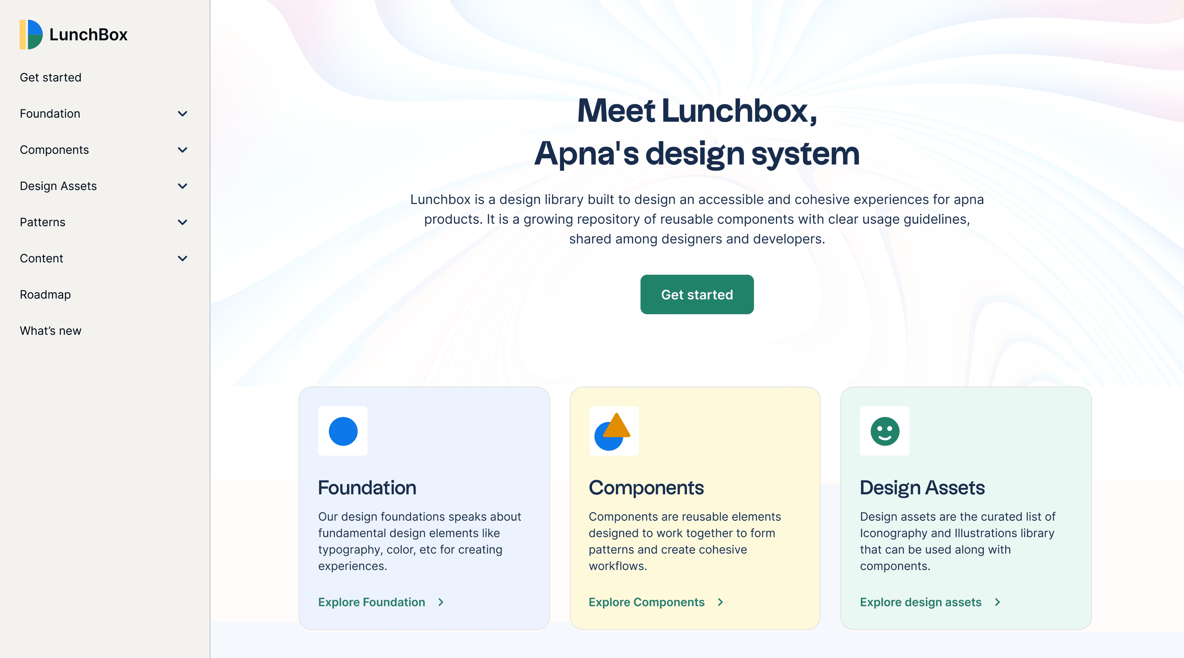
LunchBox, apna’s design system
A growing repository of reusable components to build apna's product experiences.
Designer
Developer
Researcher
Stakeholder
Copywriter
Challenge
The main challenge was to create a unified design language and provide tools and assets to designers and developers so that we can further evolve the product using this assets and guidelines. This design assets would be used by designers everyday so I personally took initiative to craft all this without slowing down other business projects.
My role
As a product designer and design systems enthusiast , I was responsible from selling the design system to documentation of guidelines to stakeholders. We have defined the plan & strategy
to design, develop & govern the system and to improve them constantly.
Team credits
Aseem - UX Researcher
Abhishek - Product designer
Sanjeev - Design director
Shyam - Frontend engineer
Harshitha - Frontend engineer
Constraints of selling a design system
Creating a design system is an interesting but still complicated and overwhelming task to maintain. Before selling it I had to explain what design systems are and how it could benefit and solve actual problems we were facing in our teams.
Starting the marathon
Before starting designing & planning, it was important to understand how different pod team works, what’s working and what’s not. Due to small team structures there was a disconnection from overall design between teams.
Auditing the existing patterns and UI
Before jumping to the actual making components, I have conducted a design audit to understand what already exists and identified some of the unforeseen gaps and issues in the product related to accessibility, UI consistency, and design unity.
Old system screens
Research on existing design systems
Over the past years design systems have become a standard for building modular and scalable products, We did a research on existing design systems to take inspiration and understand how they have put these pieces together in a meaningful and consistent way. Here are some of the systems we have researched on:
Carbon design system by IBM
Atlassian design system by Atlassian
Polaris design system by Shopify
Garden design system by Zendesk
Paste design system by Twillio
Designing the system
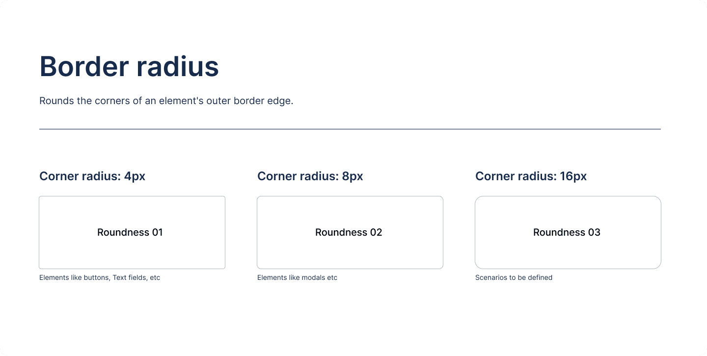
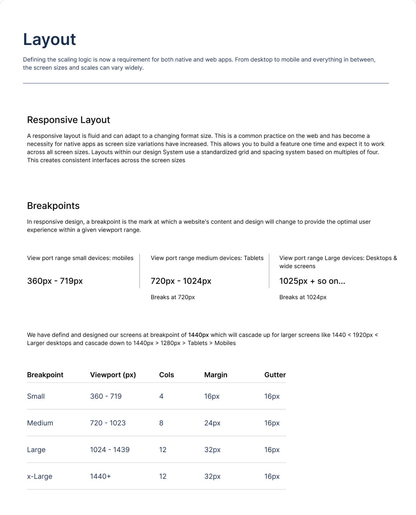
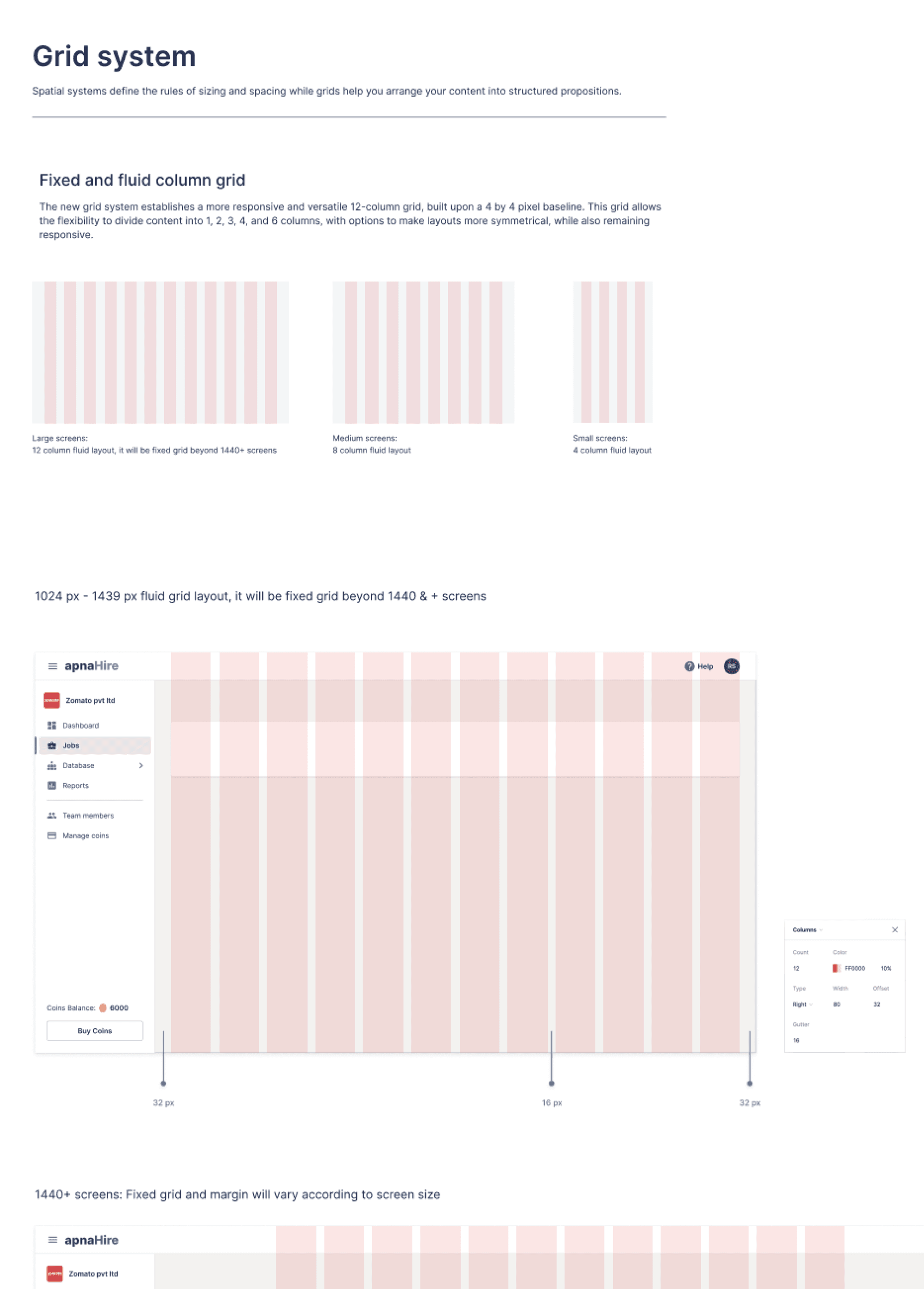
We started with defining the foundation for our new system which includes defining the value and principles of design system, Typography, colours, Elevation, Spatial system and border radius.
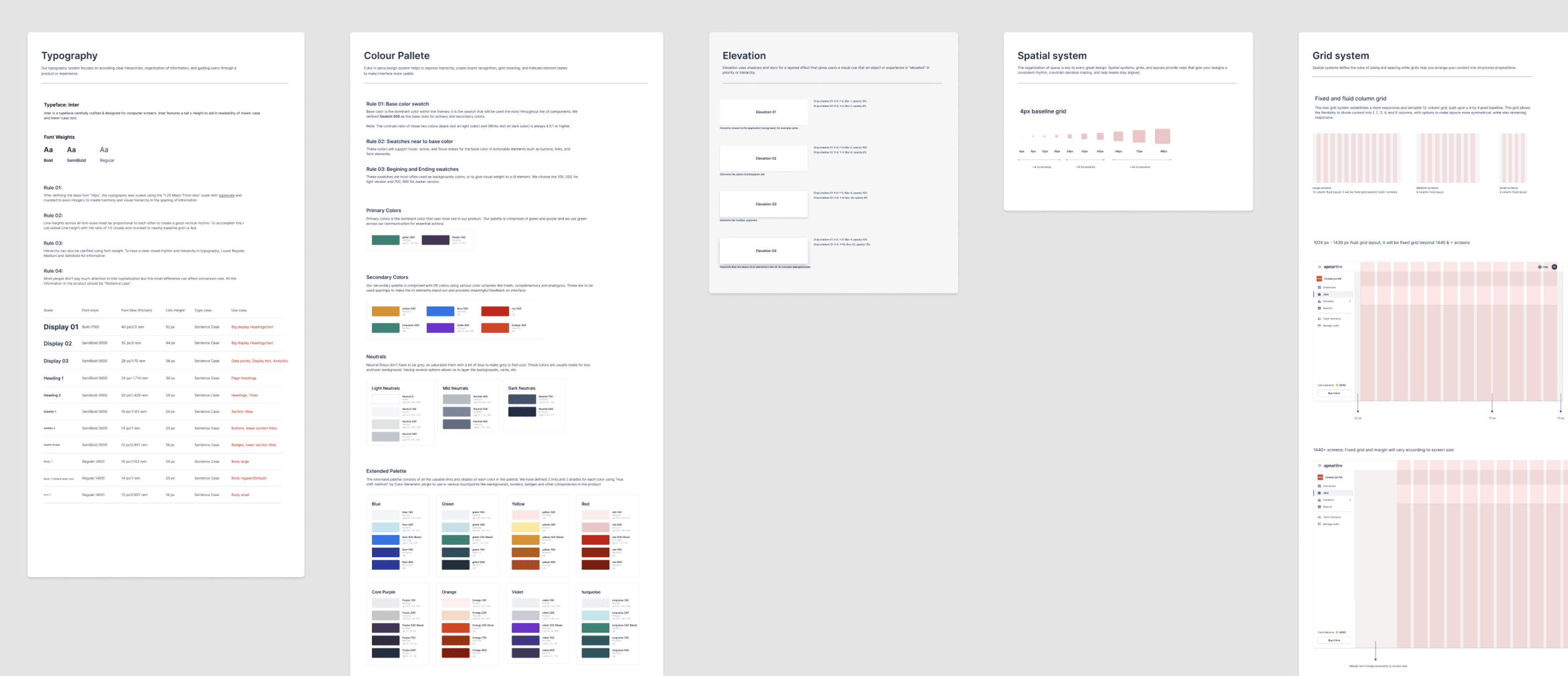
Foundation
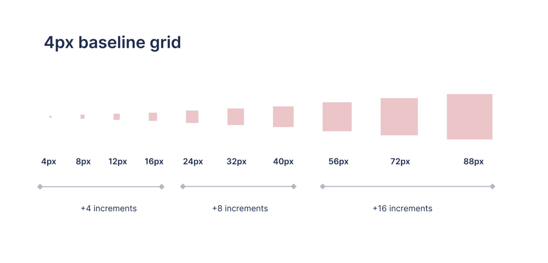
Unit
The unit is a increment number used for spacing and sizing of the elements. For this design system, I proposed 4px grid system to ensure visual consistency, balance & rhythm. It also give flexibility to design at granularity and eliminates the guesswork out of designing layouts, so all sizes, spacing (margins, padding) and line-heights in your designs are multiples of 4px.

24
160
24
24
4
8
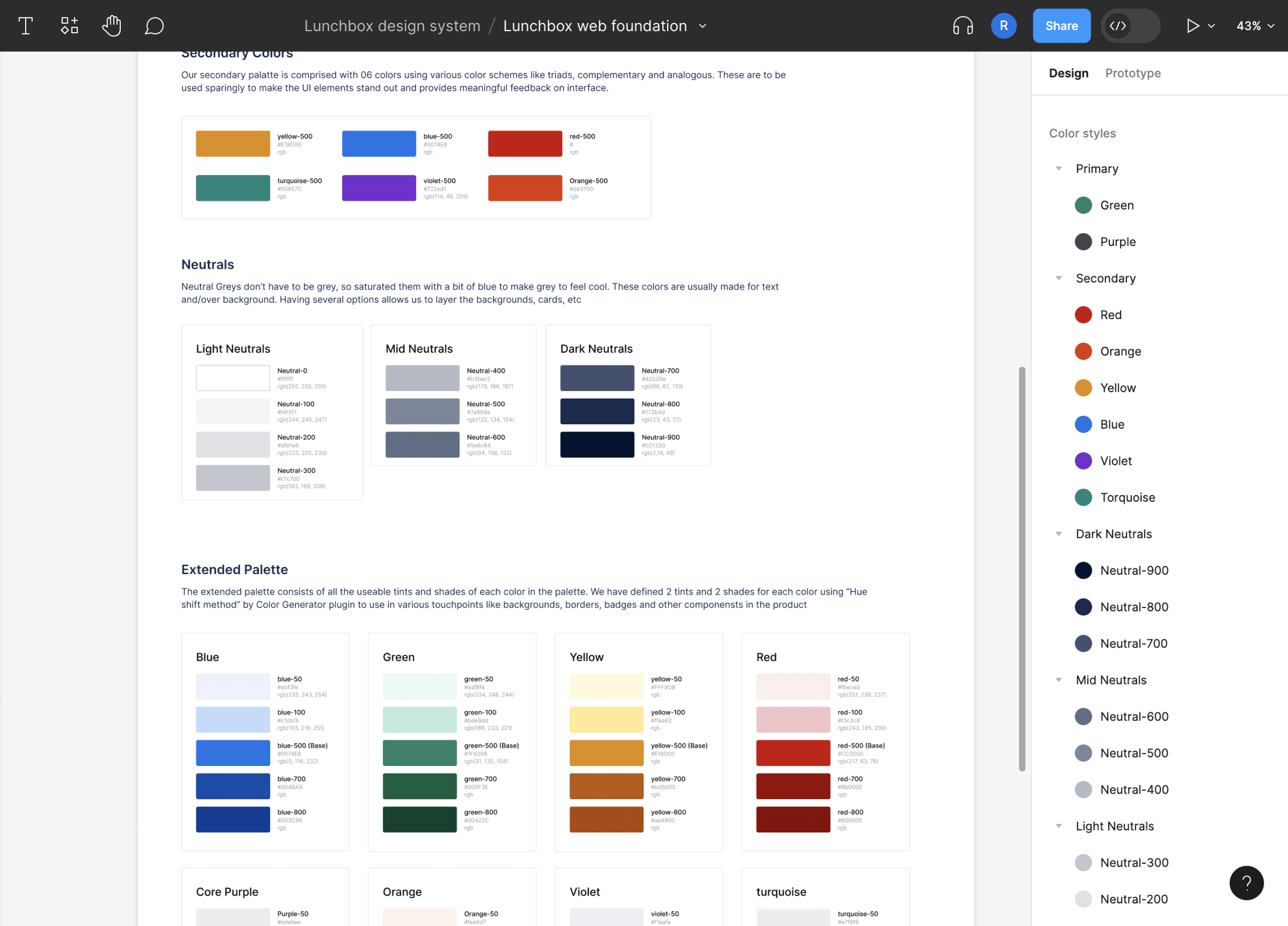
Accessible colours
Our color system is really thoughtful which adheres to the accessibility guidelines. We had created a base colour swatches and defined it’s lighter and darker shades per colour, so 100 to 800 similar same the way that CSS manages font weights. We filtered and choose 2 light and 2 dark shades to support all our interaction states and UI elements.
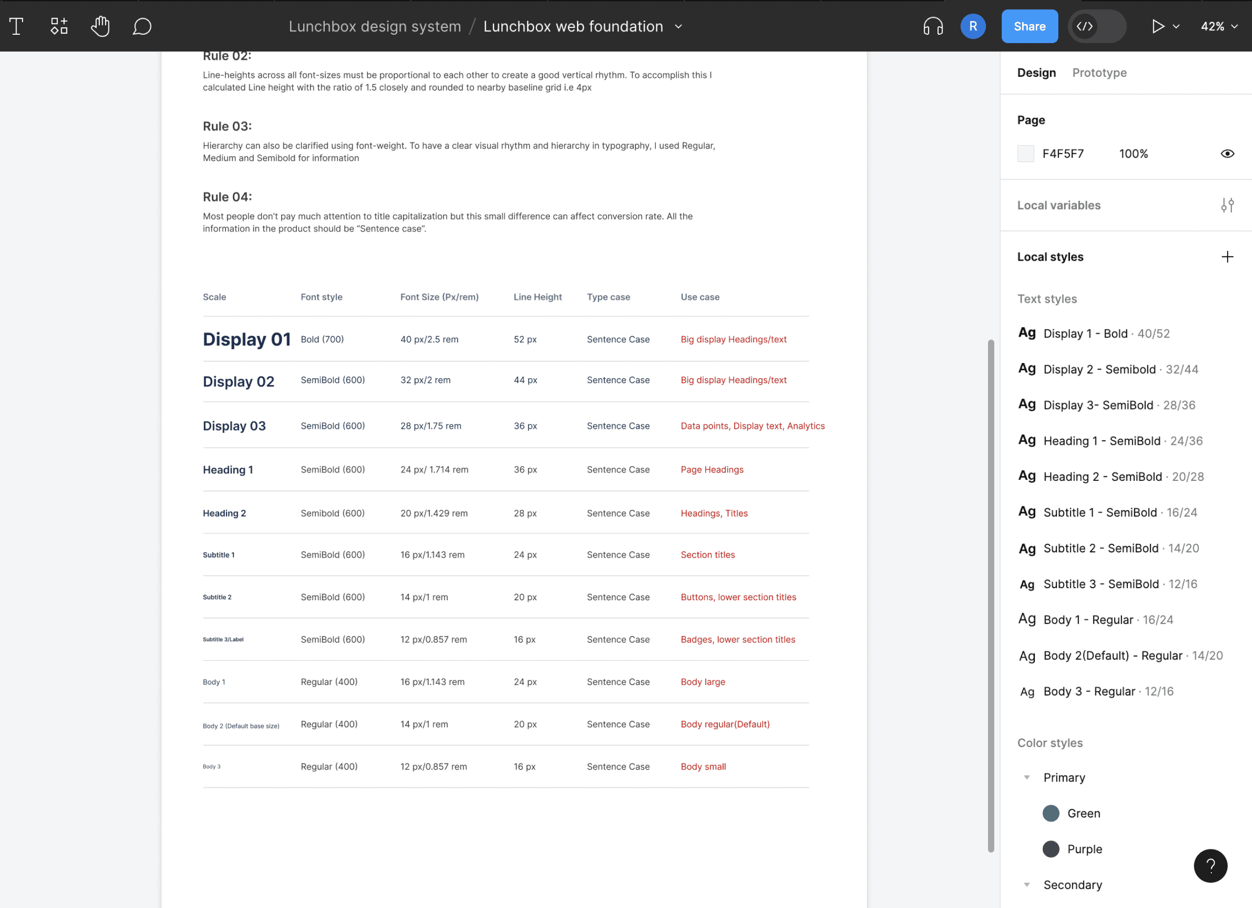
Typography & text styles
We need a typeface that has a good readability and legibility. After doing exploration, testing and careful consideration we choose Inter typeface.
For text styles, we have defined a base font and scaled using the “1.25 Major Third ratio” to create harmony and visual hierarchy in the spacing of information. Further we added 1.5 ratio of line height and rounded to nearby 4px grid.
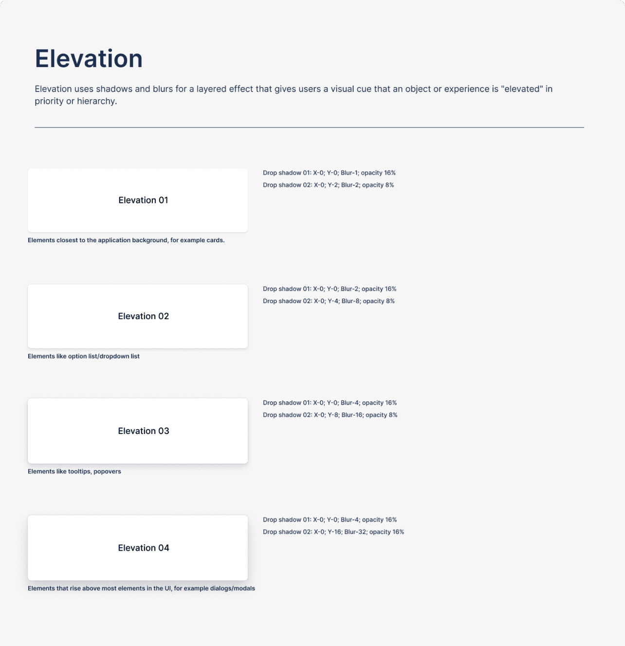
Other visual guide
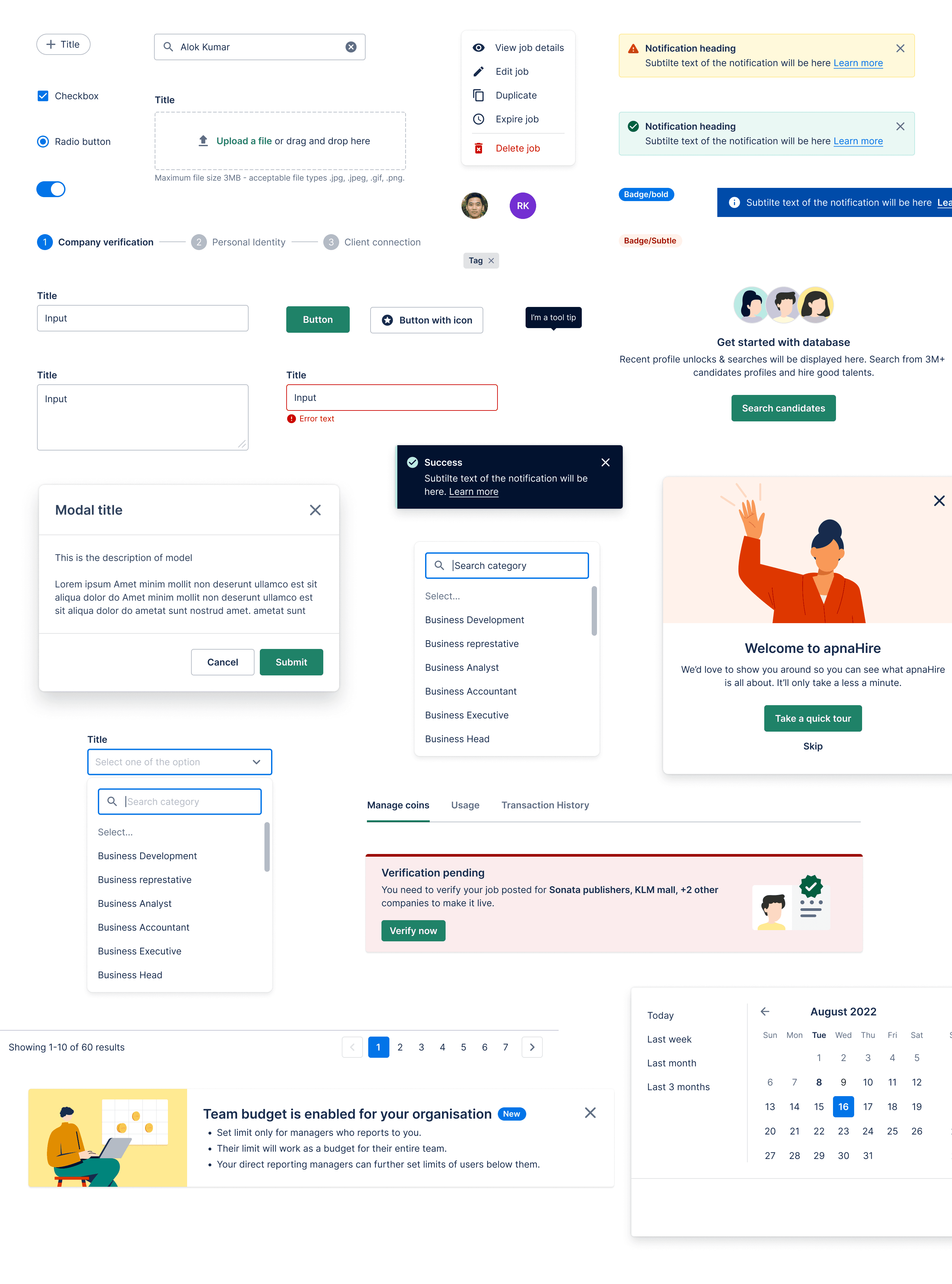
Components
We have identified most useful components that we use in our product to cover all the use cases and created a checklist of roadmap that was designed and build over a period of time. We also created basic guidelines for all components to make it easy to use and scale.
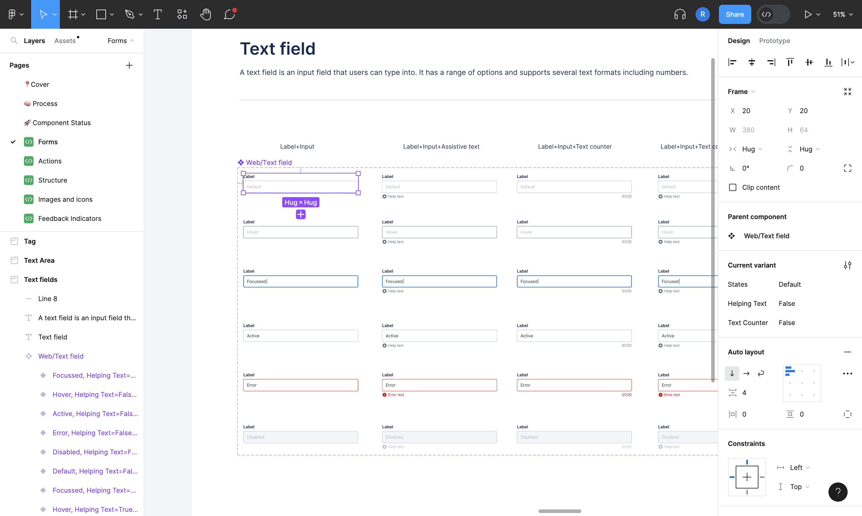
A look at the forms components in Figma
Developing the system
After designing the components, our dev team started implemented the components in React. We have used storybook for component development with some basic documentation in the initial stages.
System applied in product
Layout
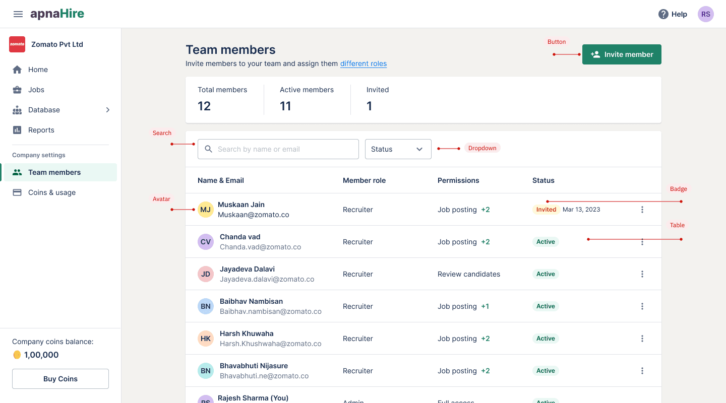
Components
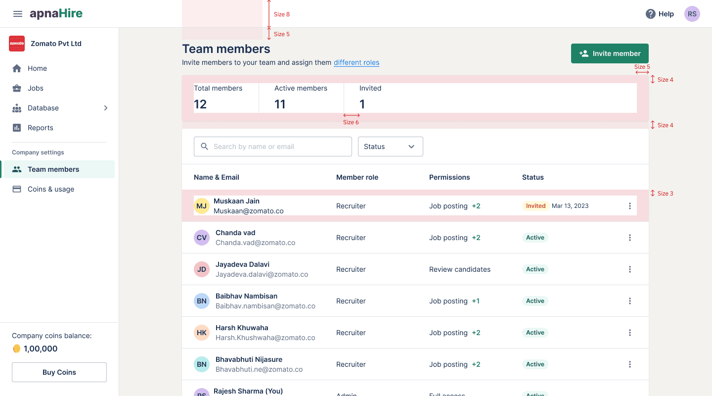
Space
Typography
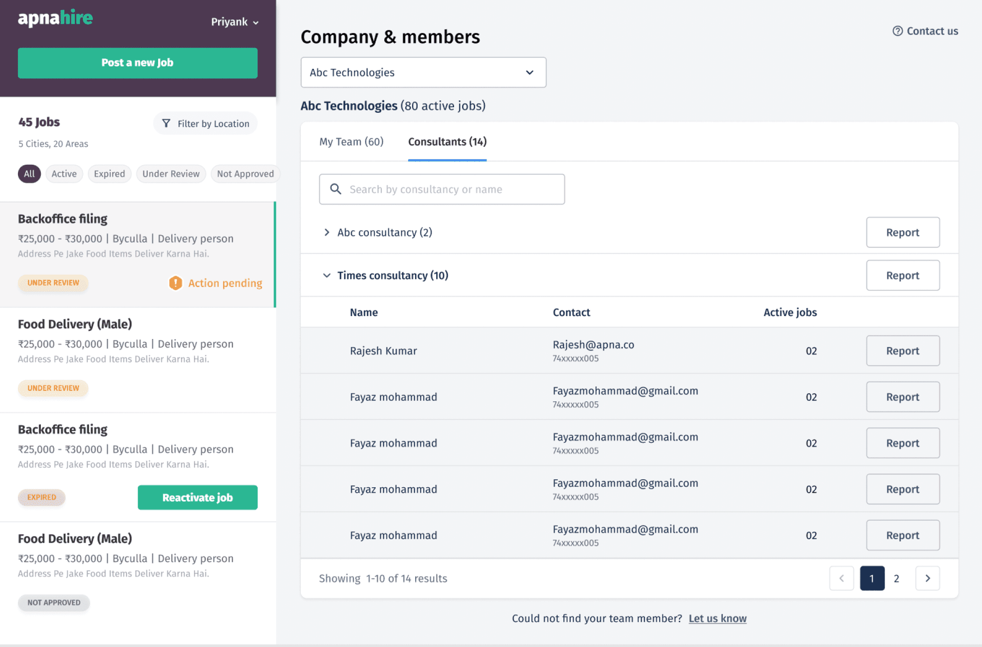
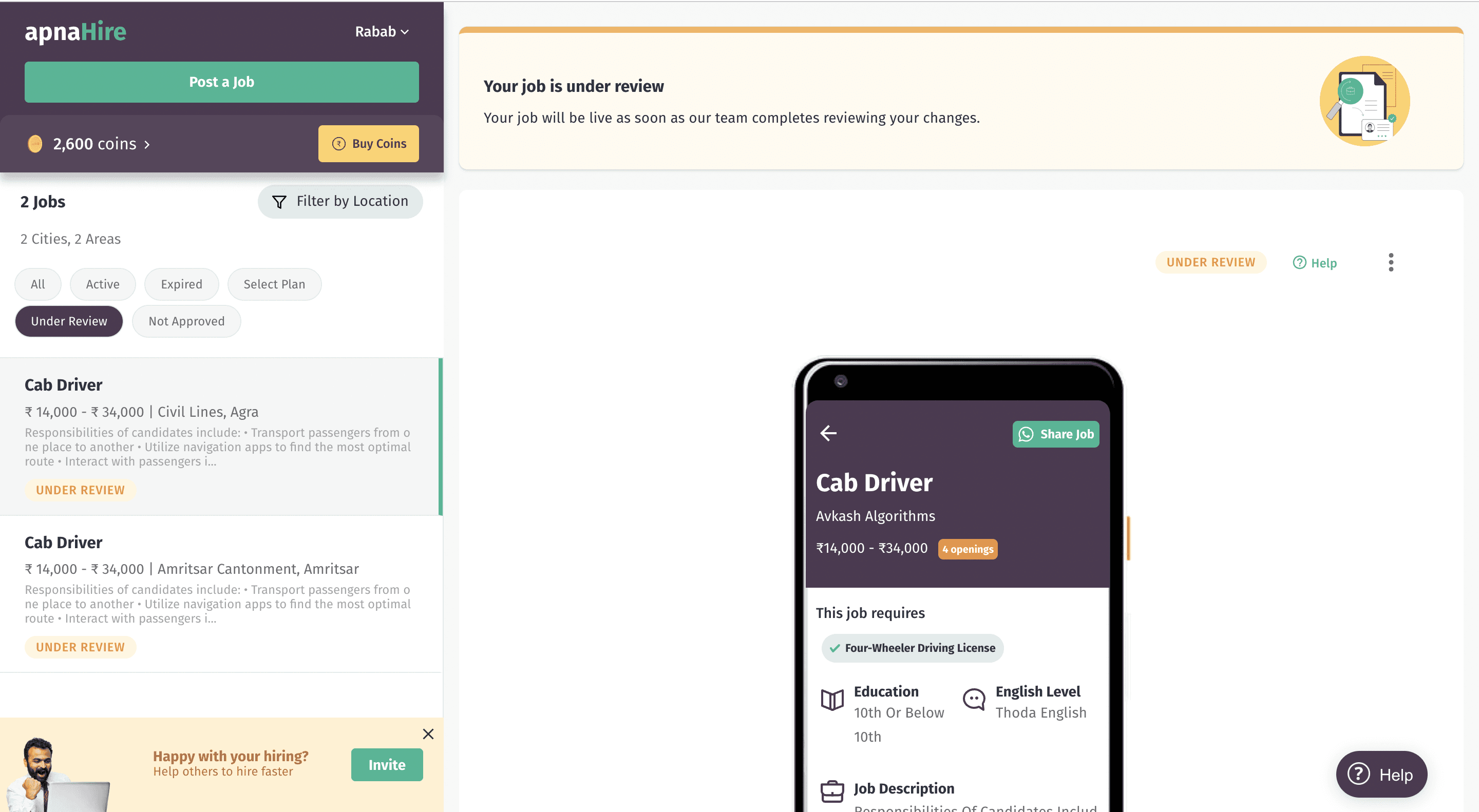
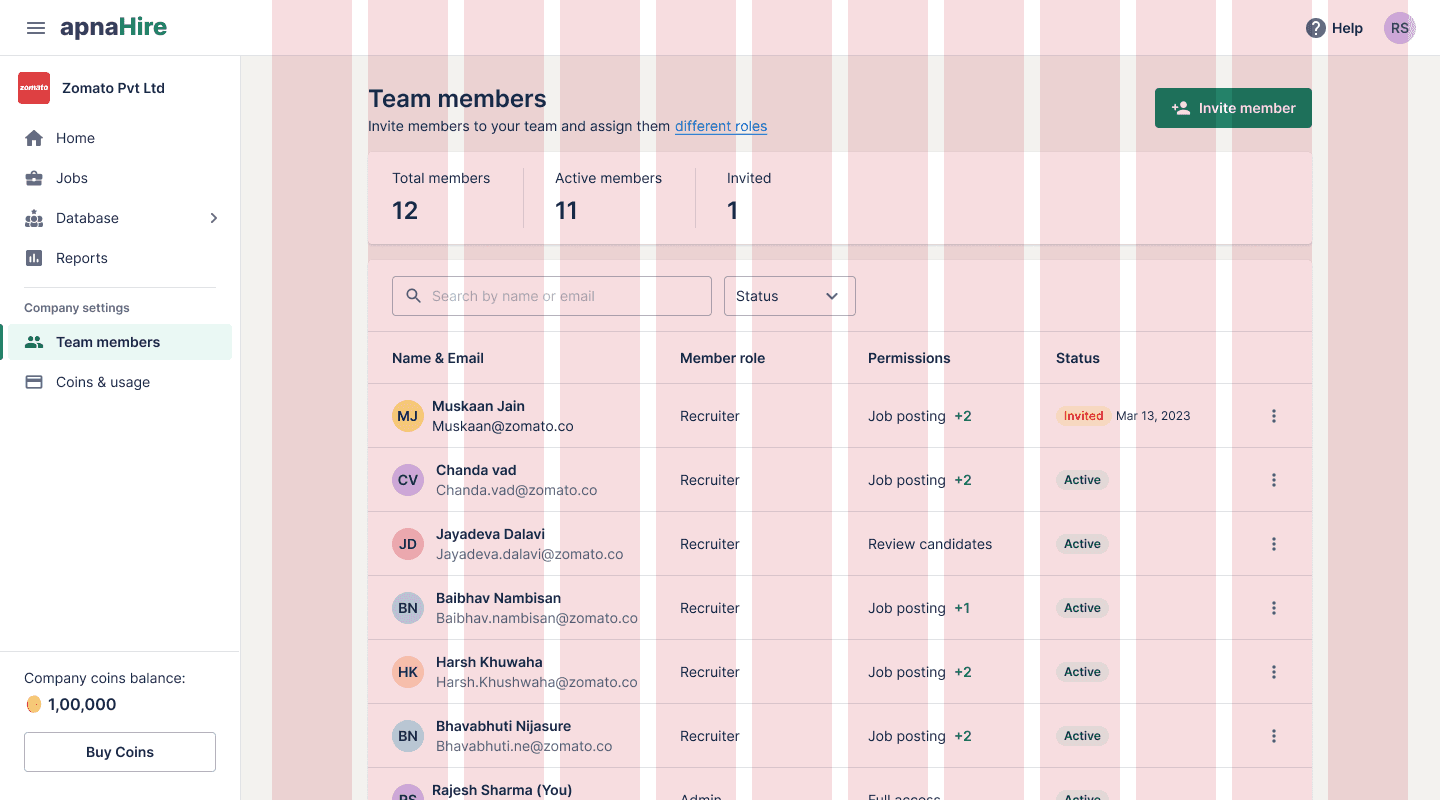
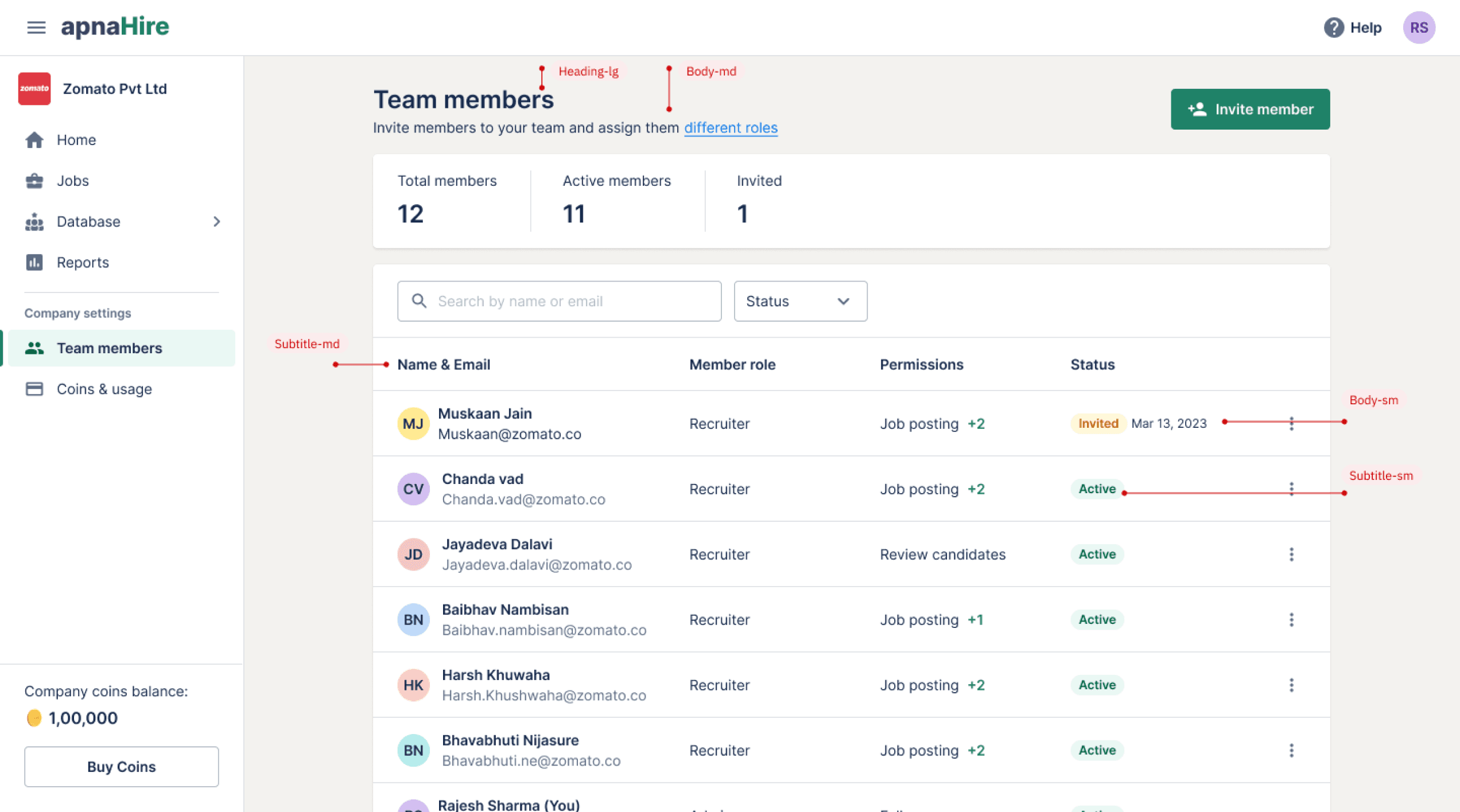
The product
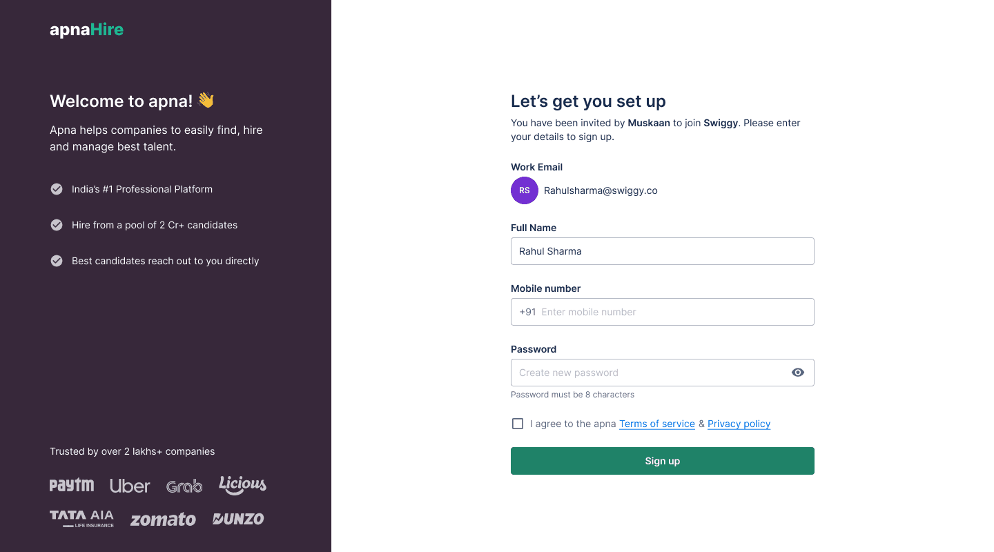
Sign up screen with the design system
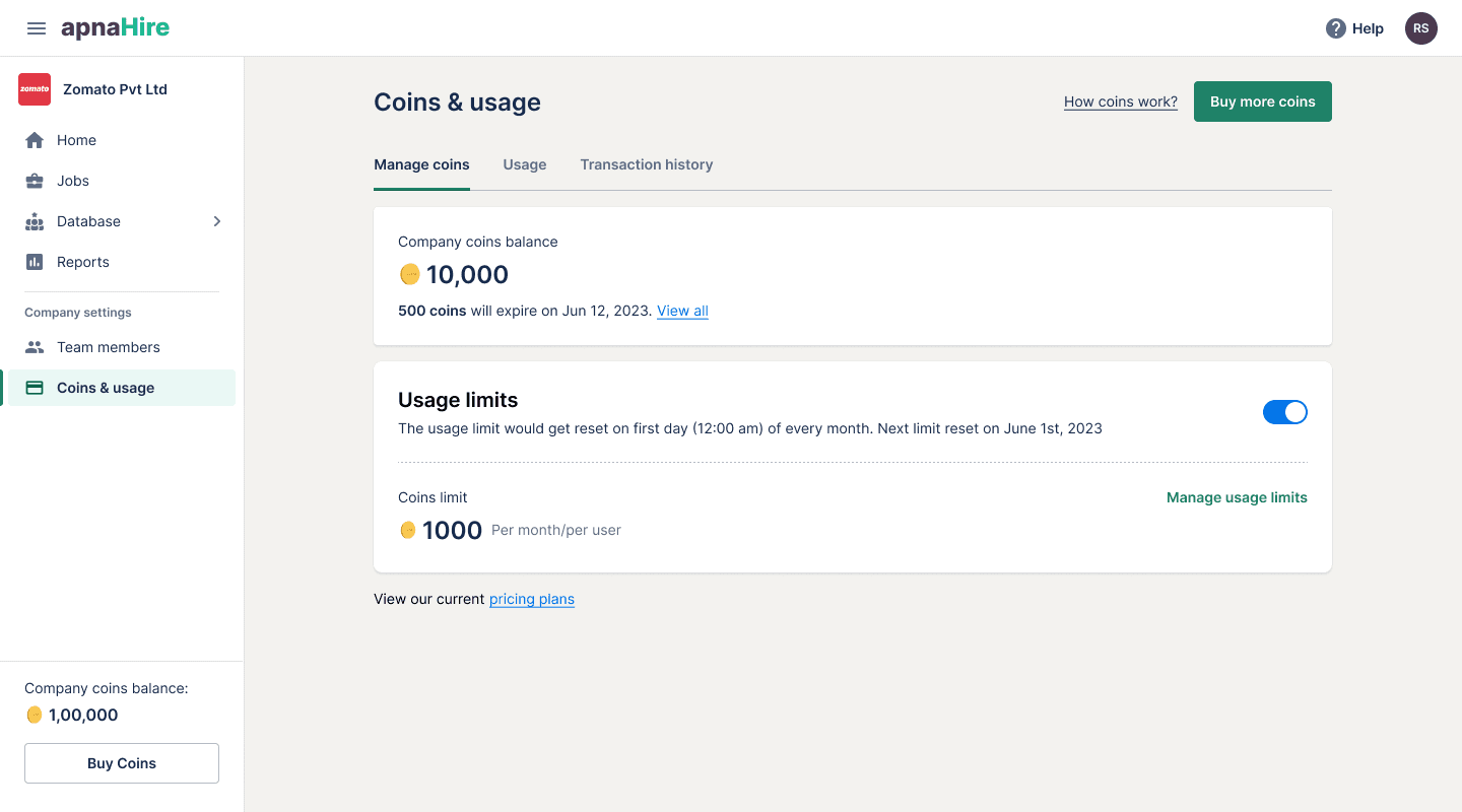
Coins & usage screen
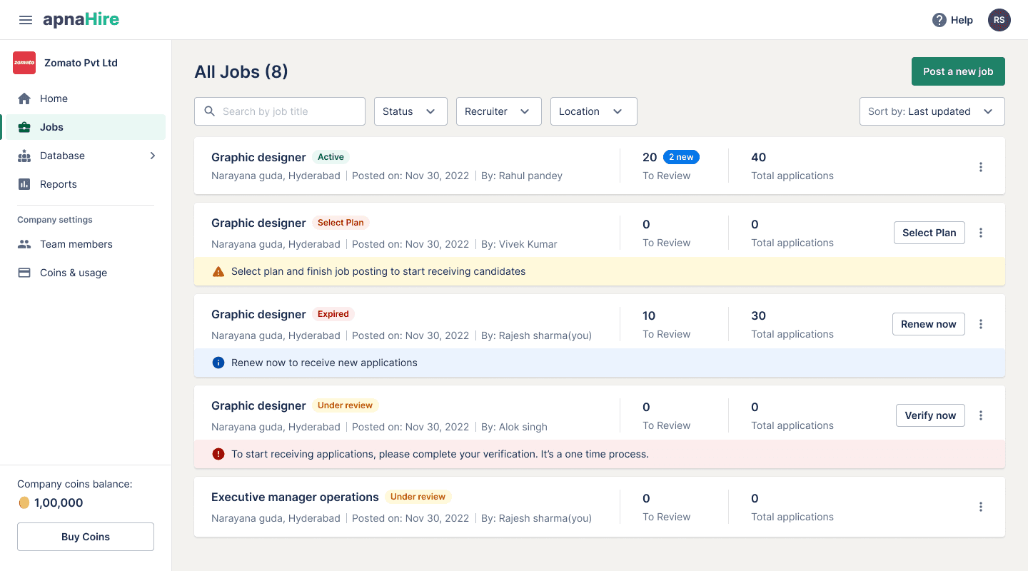
Jobs listing screen
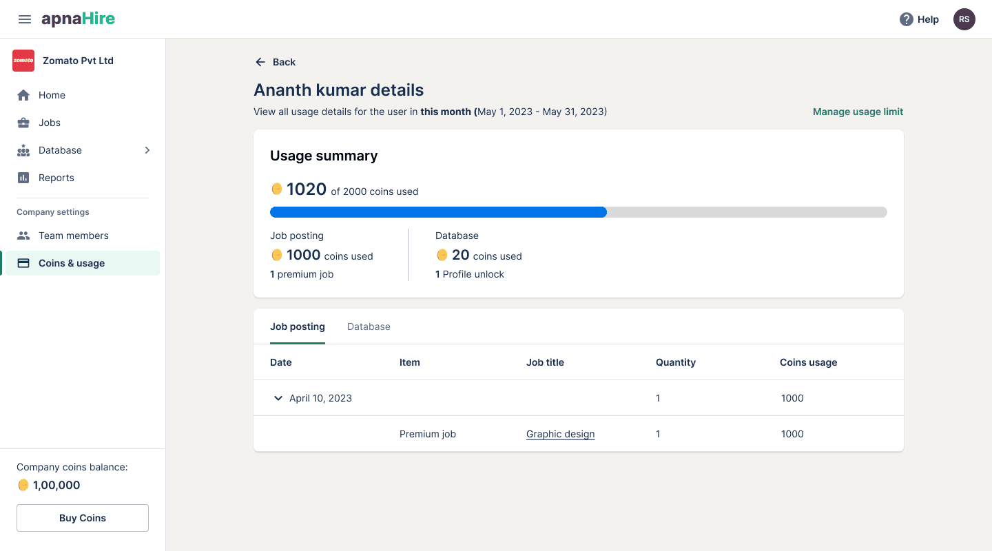
Coins usage details screen
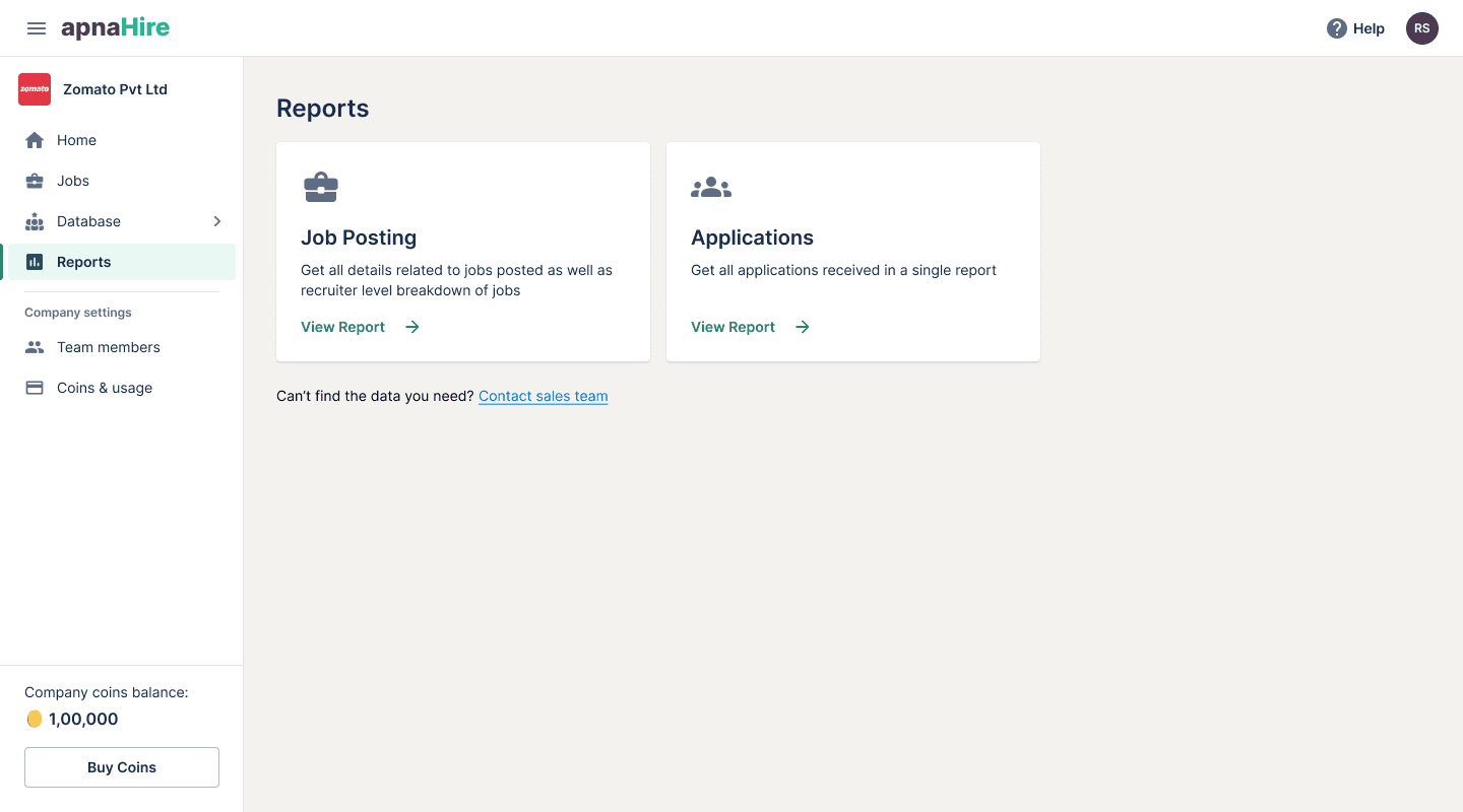
Reporting center screen
Learnings
Design systems are crucial part of product design & development process. It helps designers & developers focus on solving bigger challenges without worrying much about UI details. Here are few lessons we’ve learned along the way to help you build yours
more efficiently.
Design system is a living document and it is never finished
It was always easy to add to things in the future than to remove, so think before adding something to the system to decrease the complexity, confusion and other headaches.
Design guidelines must not be written in stone. It should be a team’s empowerment and synchronization tool that should be challenged whenever necessary.
Documentation should be created for design systems of any scale. It allows everyone to make consistent decisions, fast and efficiently.
Measuring the adoption of design system is must. It helps in understanding the usage and challenges to add & subtract and iterate on the system.
🎉