Designer
Developer
Researcher
Stakeholder
Copywriter
Back
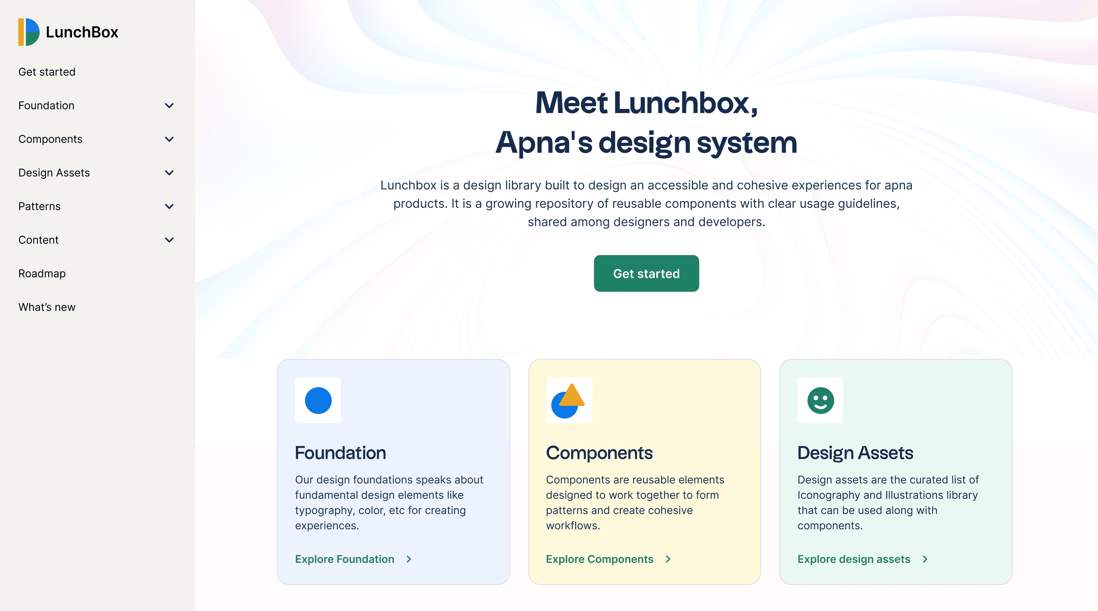
LunchBox, apna’s design system
A growing repository of reusable components to build apna's product experiences.
Research on existing design systems
Over the past years design systems have become a standard for building modular and scalable products, We did a research on existing design systems to take inspiration and understand how they have put these pieces together in a meaningful and consistent way. Here are some of the systems we have researched on:


Designing the system
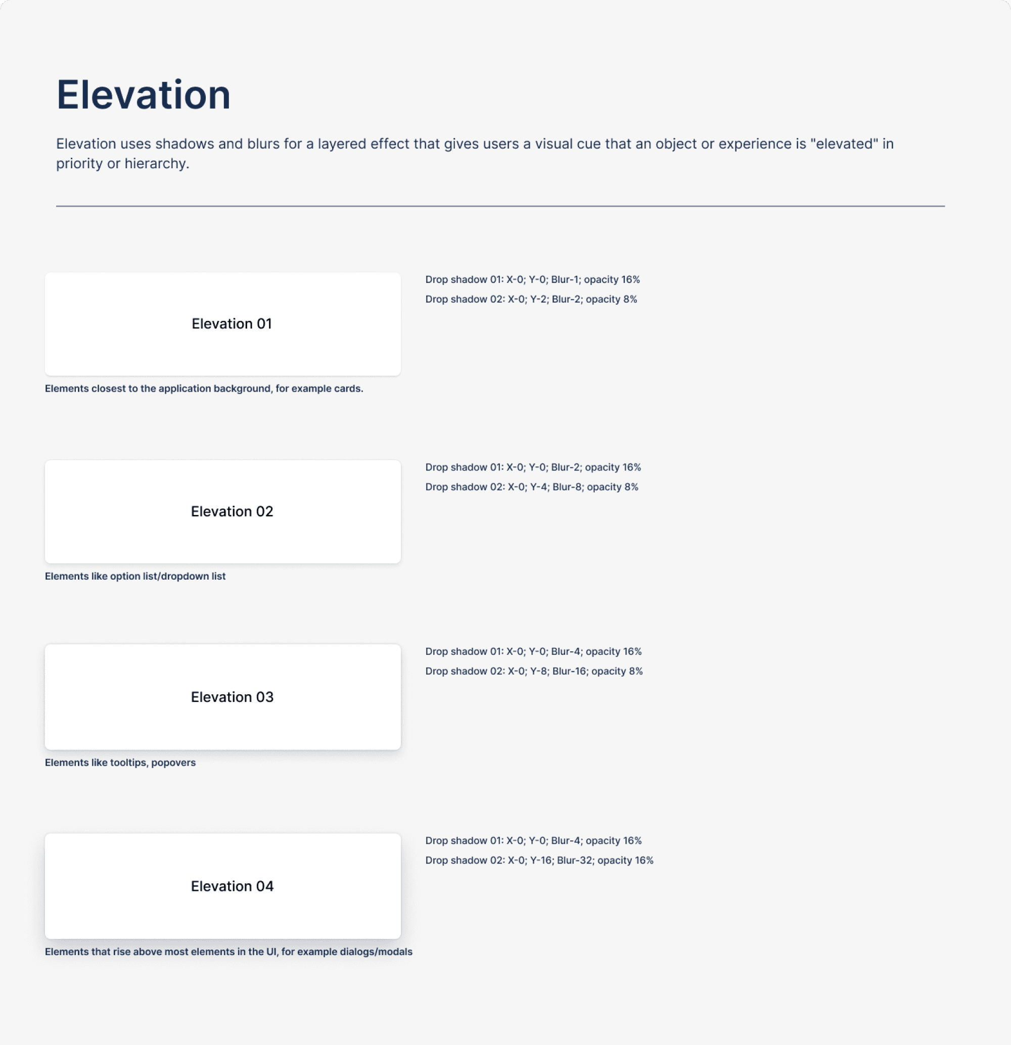
We started with defining the foundation for our new system which includes defining the value and principles of design system, Typography, colours, Elevation, Spatial system and border radius.
Branding (Naming and Logo)
After discussing with senior leadership, we chose “LunchBox” because it was the element that unites the people across the teams together in the organisation during the break hours. so similarly this visual language should be in central, touching every screen and component.
We have created a logo that pictured the letter L and B of lunchbox with geometric forms symbolising the fact that the design system is the sum of different parts coming together to create harmony and balance.
Unit system
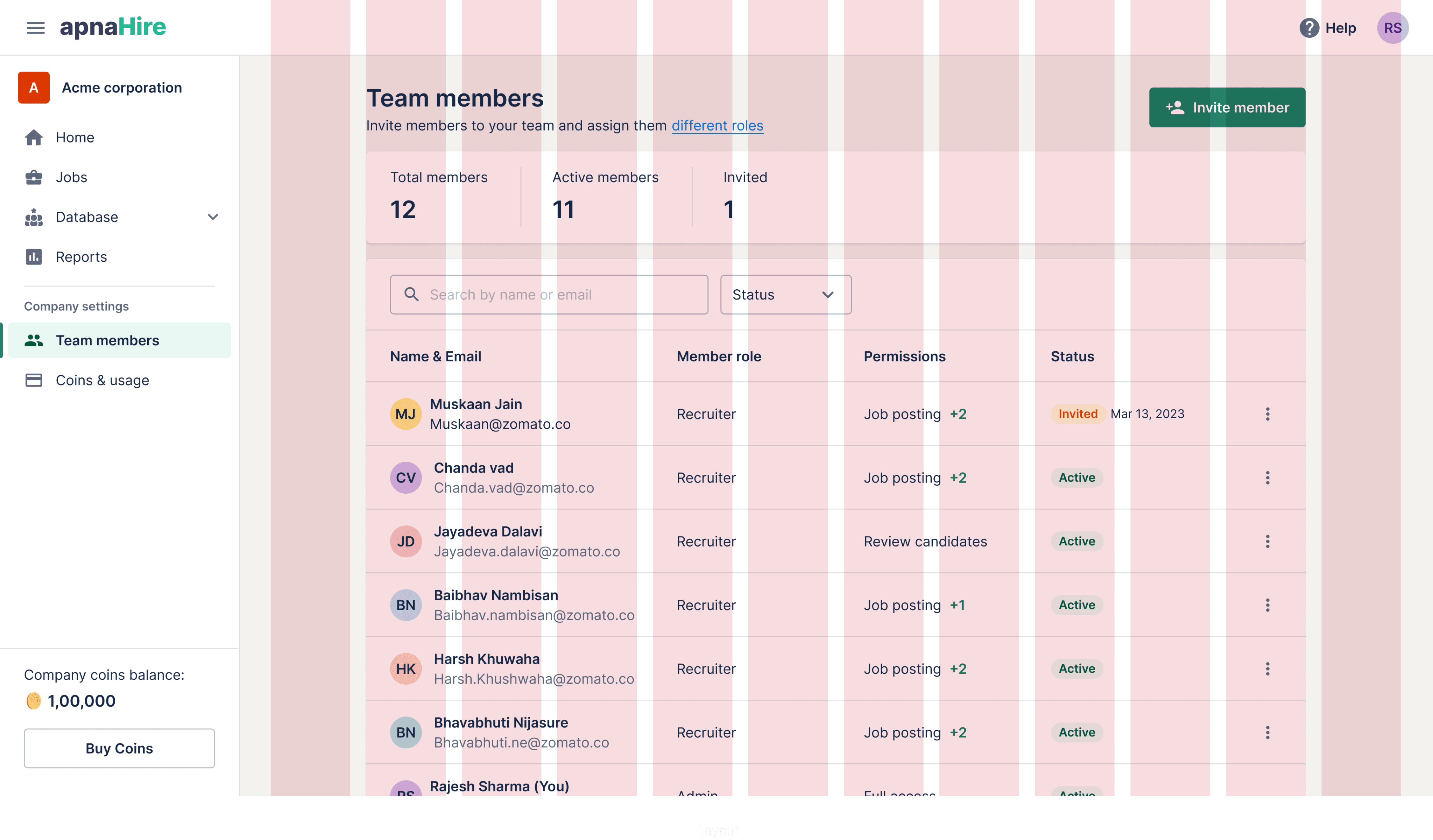
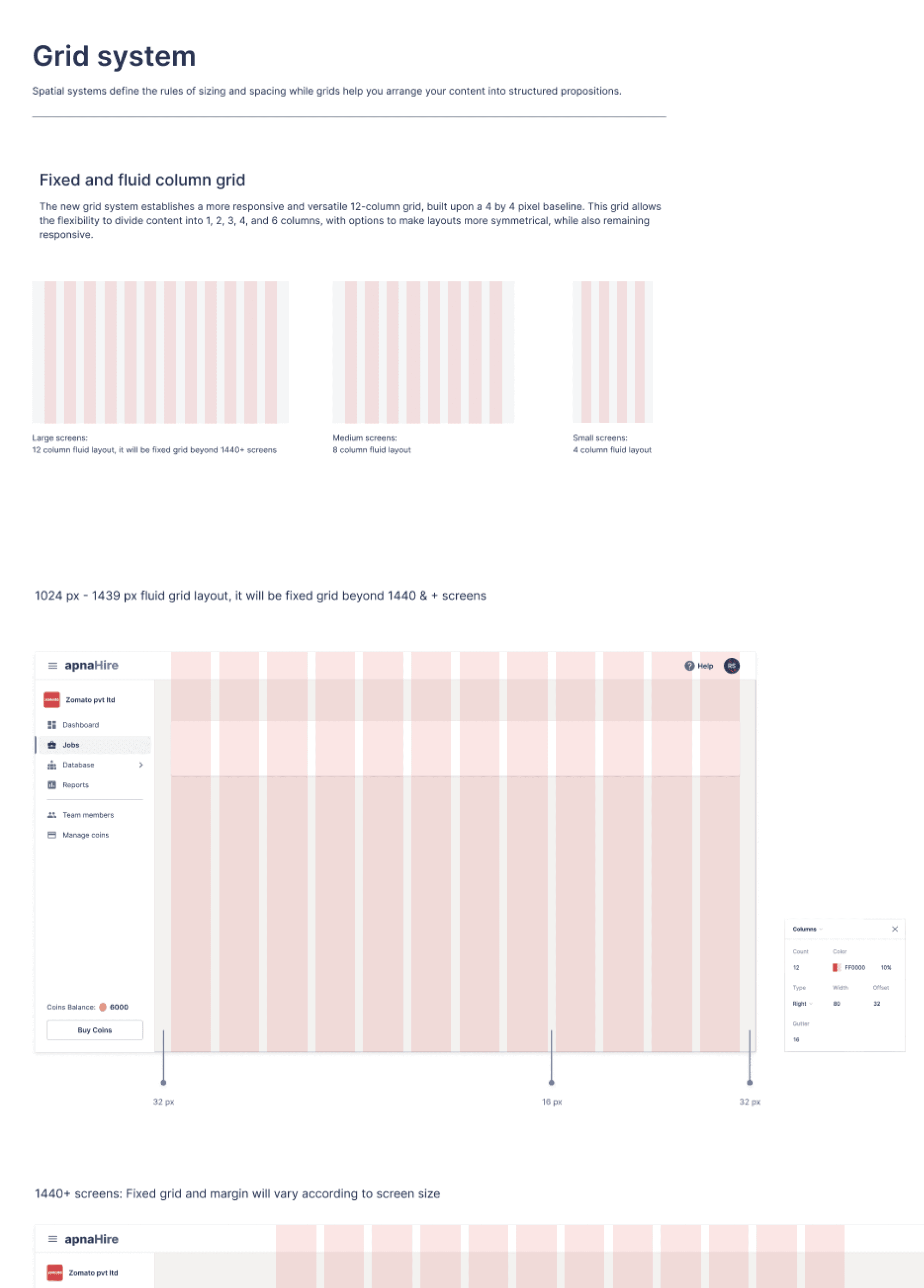
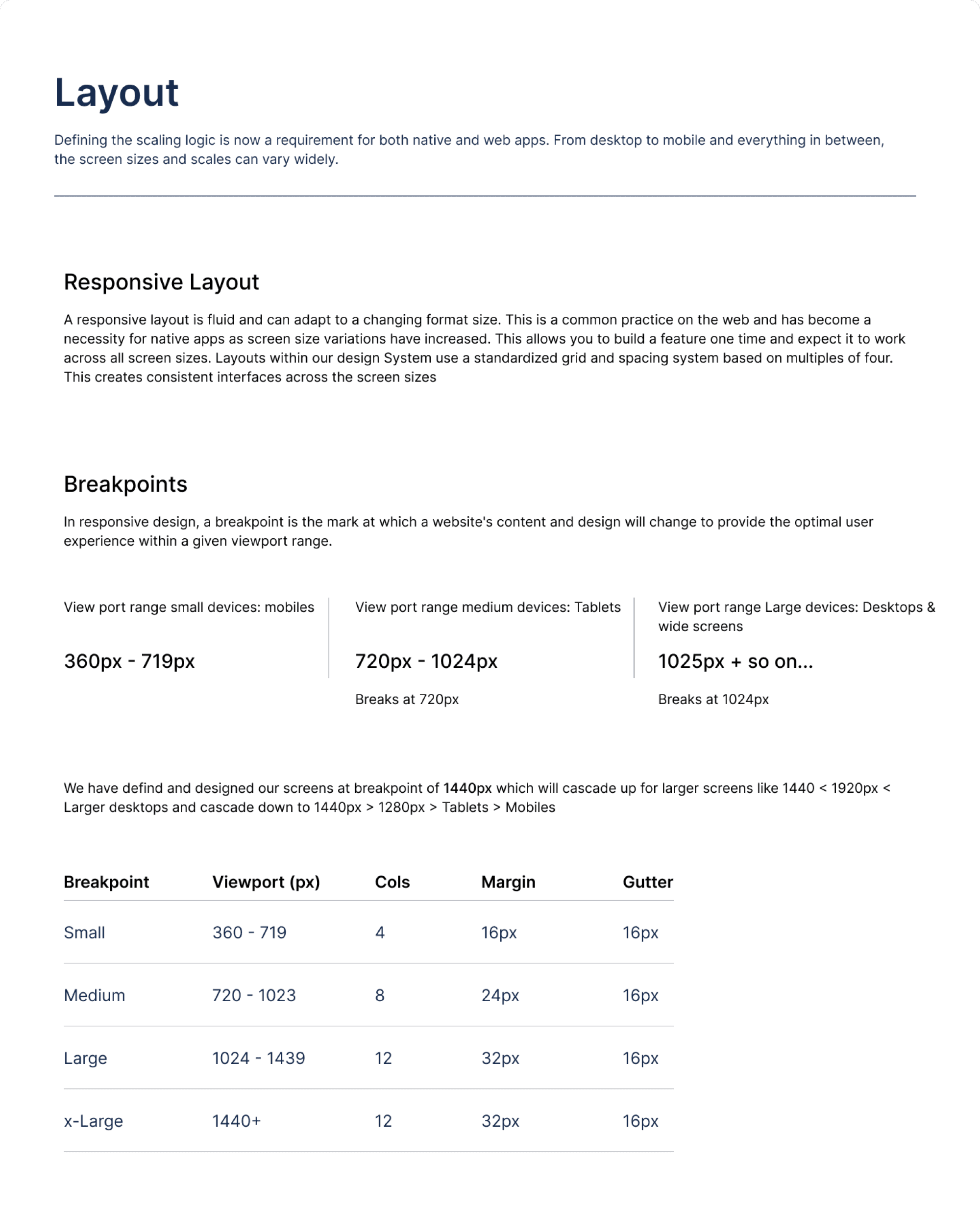
The unit is a increment number used for spacing and sizing of the elements. For this design system, I proposed 4px grid system to ensure visual consistency, balance & rhythm. It also give flexibility to design at granularity and eliminates the guesswork out of designing layouts, so all sizes, spacing (margins, padding) and line-heights in your designs are multiples of 4px.
Color system
Our color system is really thoughtful which adheres to the accessibility guidelines, with coloured text combinations tested against AA and AAA standards. We had created a base colour swatches and defined it’s lighter and darker shades per colour, so 100 to 800 similar same the way that CSS manages font weights. We filtered and choose 2 light and 2 dark shades to support all our interaction states and UI elements.
Typography & text styles
We need a typeface that has a good readability and legibility. After doing exploration, testing and careful consideration we choose Inter typeface. For text styles, we have defined a base font and scaled using the “1.25 Major Third ratio” to create harmony and visual hierarchy in the spacing of information. Further we added 1.5 ratio of line height and rounded to nearby 4px grid.
Components
We have identified most useful components that we use in our product to cover all the use cases and created a checklist of roadmap that was designed and build over a period of time. We also created basic guidelines for all components to make it easy to use and scale.


Developing the system
After designing the components, we have implemented our common repository of the components with the combination of internal & open source system, shared across the different teams. We have used zero height with some basic documentation in the initial stages.
Auditing the existing designs
Before jumping to the actual making components, I have conducted a design audit to understand what already exists and identified some of the unforeseen gaps and issues in the product related to accessibility, UI consistency, and design unity.
Starting a marathon
We agreed on a principle that having a common unified visual language would be good thing to have but it was never a priority because it was not a feature that we will sell. So, we need to consider this system as a product, disrupting the way things were done before.
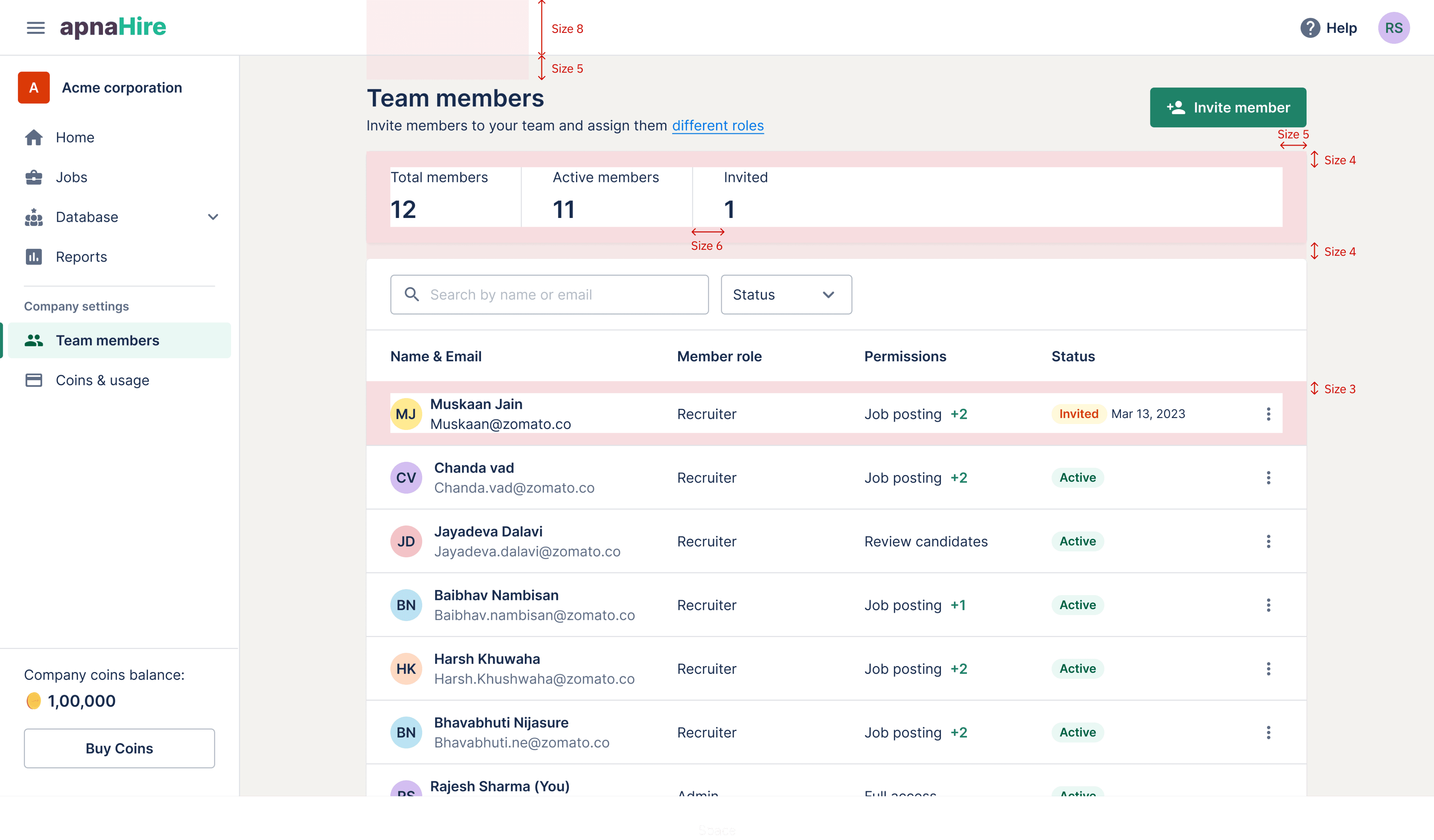
Employer platform: Before
The 3C’s design principles:
Consistency (Systems–based Design)
Content (Design is communication)
Composition (Arrangements of visuals)
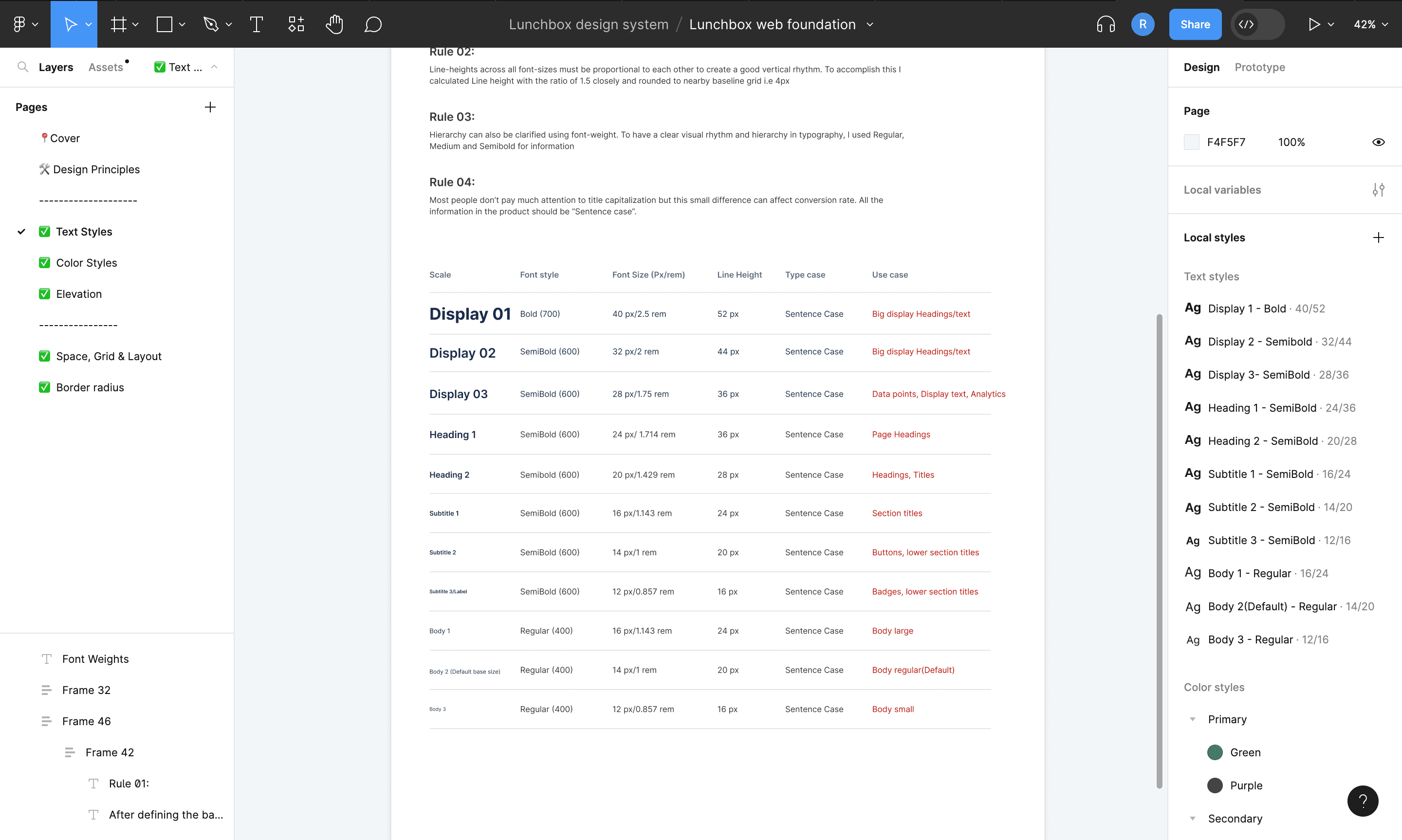
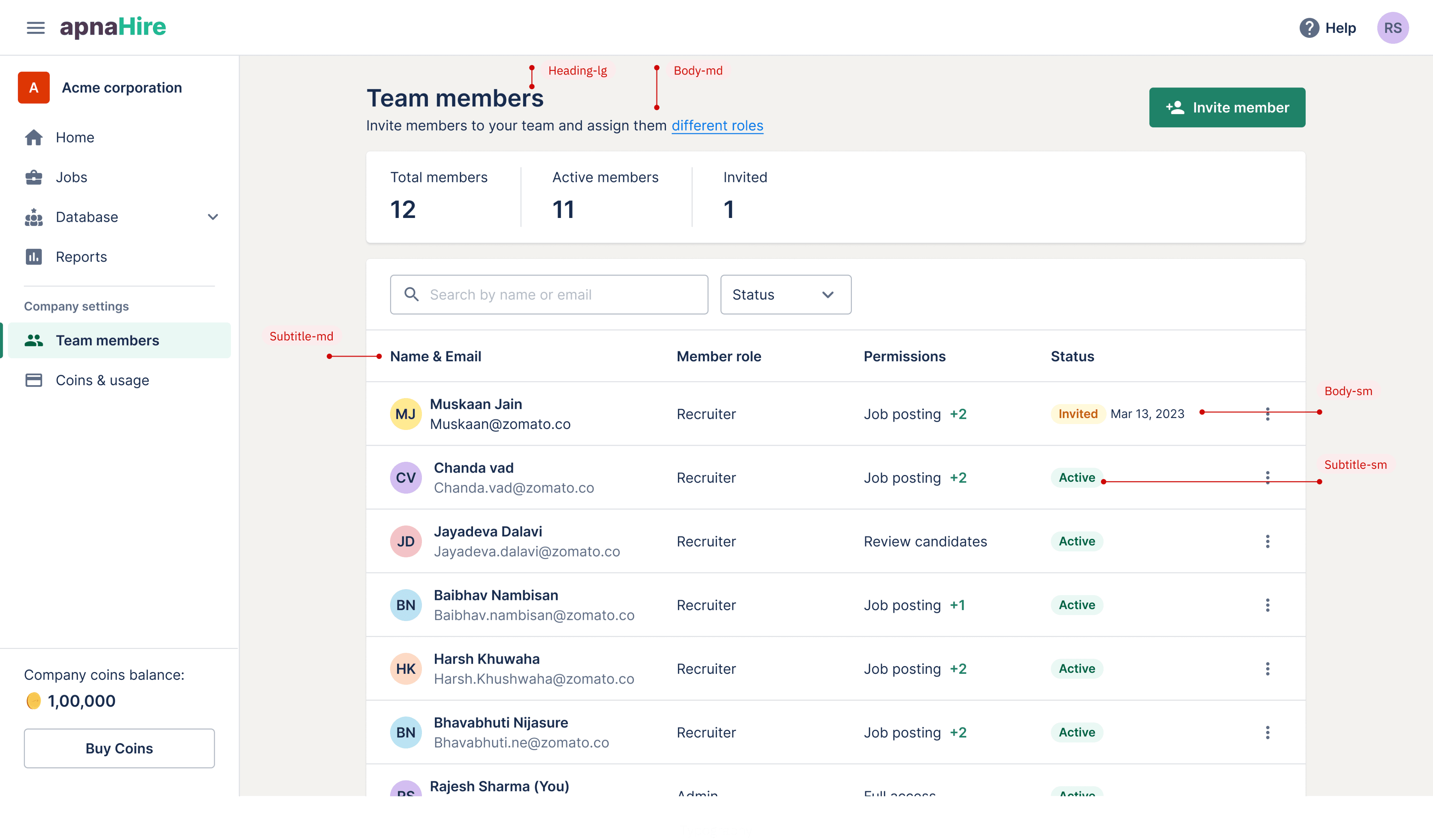
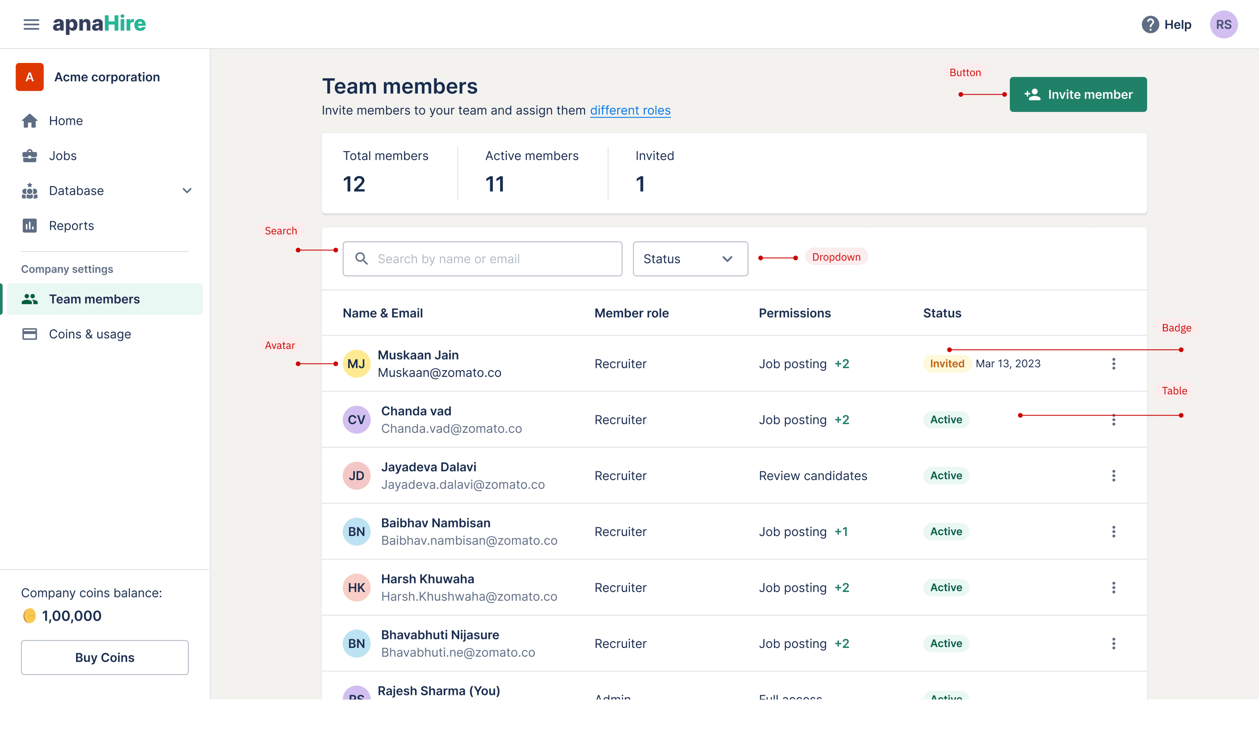
Text styles
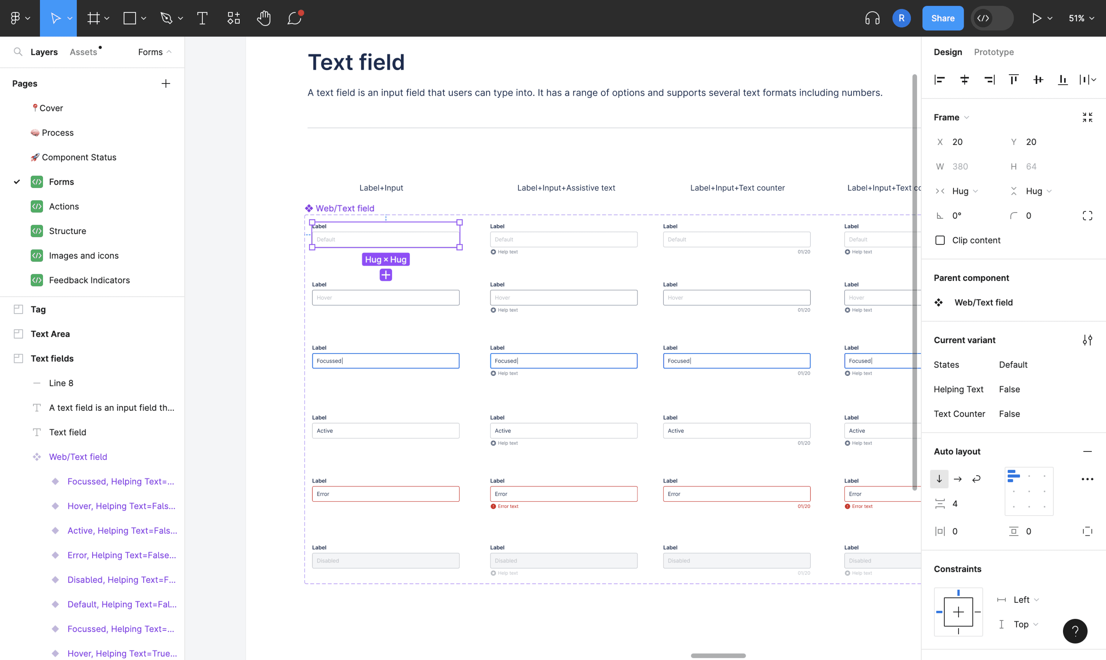
A look at the form component in Figma
Components library
Title
Checkbox
Radio button
Title
Select one of the option
|Search category
Select...
Business Development
Business represtative
Business Analyst
Business Accountant
Business Executive
Business Head
Title
Upload a file
or drag and drop here
Maximum file size 3MB - acceptable file types .jpg, .jpeg, .gif, .png.
Alok Kumar
1
Company
2
Personal Identity
3
Client connection
Title
Input
Title
Input
Tag
Title
Input
Error text
Button
Button with icon
Get started with database
Recent profile unlocks & searches will be displayed here. Search from 3M+ candidates profiles and hire good talents.
Search candidates

RK
Success
Subtilte text of the notification will be here. Learn more
Badge/bold
Badge/Subtle
|Search category
Select...
Business Development
Business represtative
Business Analyst
Business Accountant
Business Executive
Business Head
I’m a tool tip
Manage coins
Usage
Transaction History
Showing 1-10 of 60 results
1
2
3
4
5
6
7
August 2022
September 2022
31
30
29
28
27
26
25
24
23
22
21
20
19
18
17
16
15
14
13
12
11
10
9
8
7
6
5
4
3
2
1
Sat
Fri
Thu
Wed
Tue
Mon
Sun
31
30
29
28
27
26
25
24
23
22
21
20
19
18
17
16
15
14
13
12
11
10
9
8
7
6
5
4
3
2
1
Sat
Fri
Thu
Wed
Tue
Mon
Sun
Cancel
Apply
Welcome to apnaHire
We’d love to show you around so you can see what apnaHire is all about. It’ll only take a less a minute.
Take a quick tour
Skip
Verification pending
You need to verify your job posted for Sonata publishers, KLM mall, +2 other companies to make it live.
Verify now
Team budget is enabled for your organisation
New
Set limit only for managers who reports to you.
Their limit will work as a budget for their entire team.
Your direct reporting managers can further set limits of users below them.
Notification heading
Subtilte text of the notification will be here
Learn more
Notification heading
Subtilte text of the notification will be here
Learn more
Subtilte text of the notification will be here
Learn more
View job details
Edit job
Duplicate
Expire job
Delete job
Modal title
This is the description of model
Lorem ipsum Amet minim mollit non deserunt ullamco est sit aliqua dolor do Amet minim mollit non deserunt ullamco est sit aliqua dolor do ametat sunt nostrud amet. ametat sunt
Cancel
Submit
Product
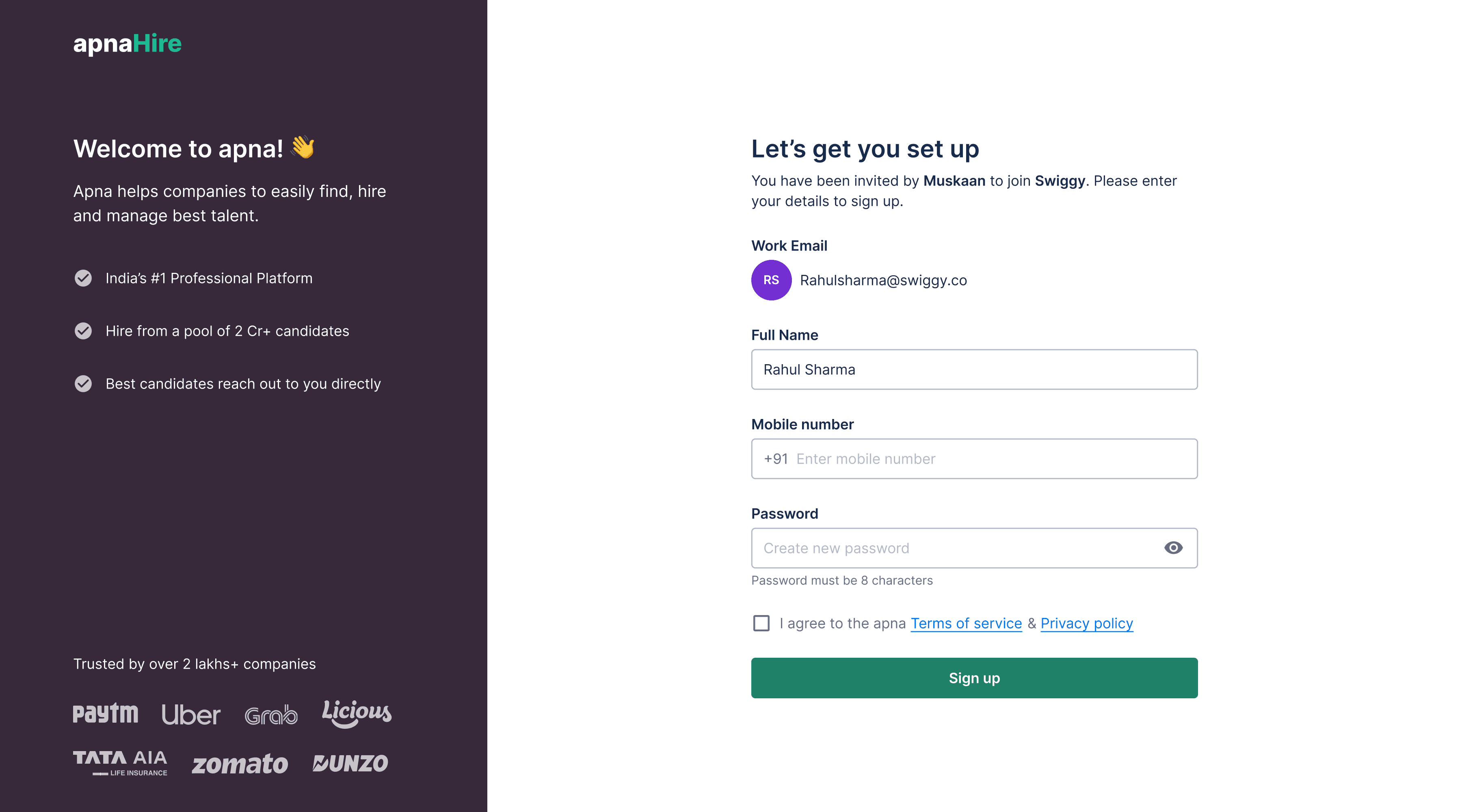
Sign up screen with the design system

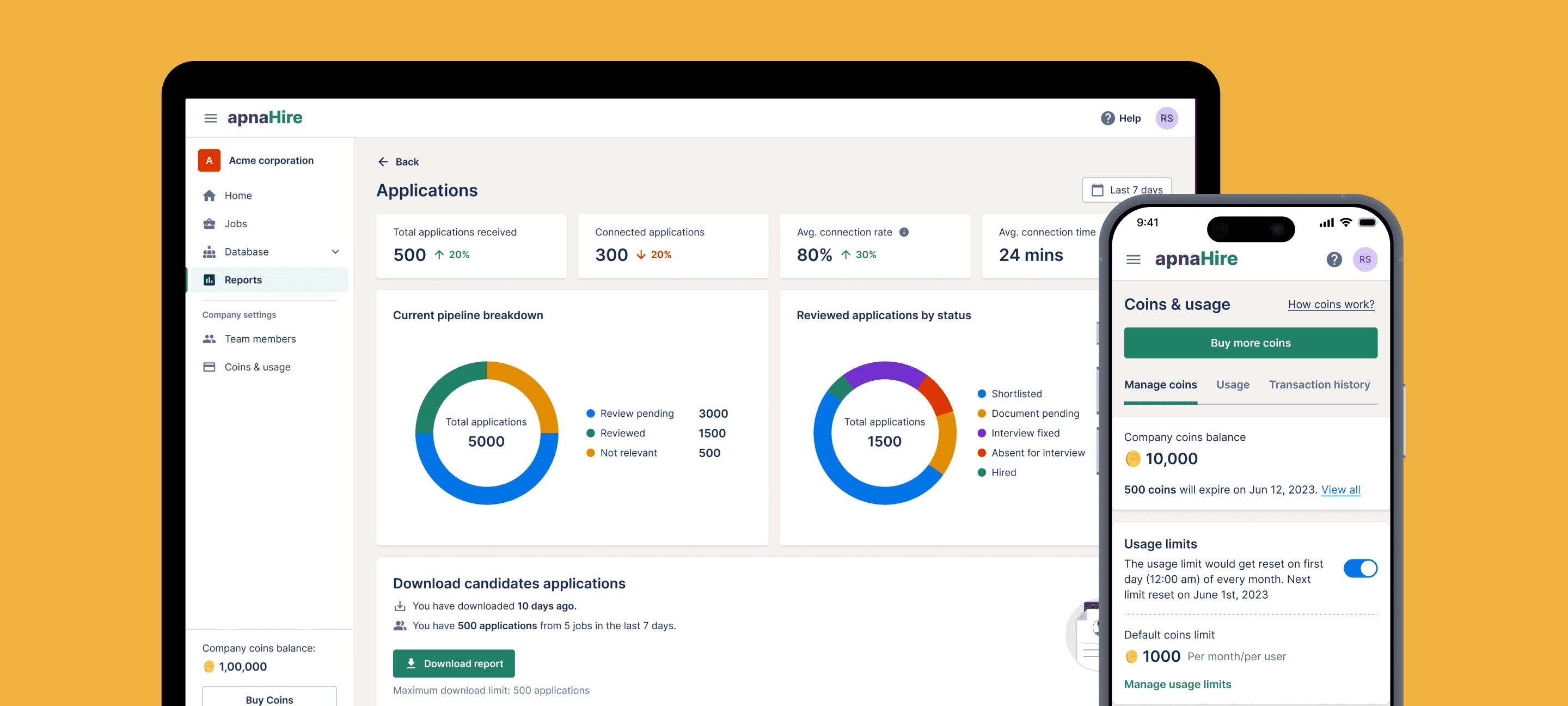
Coins & usage screen

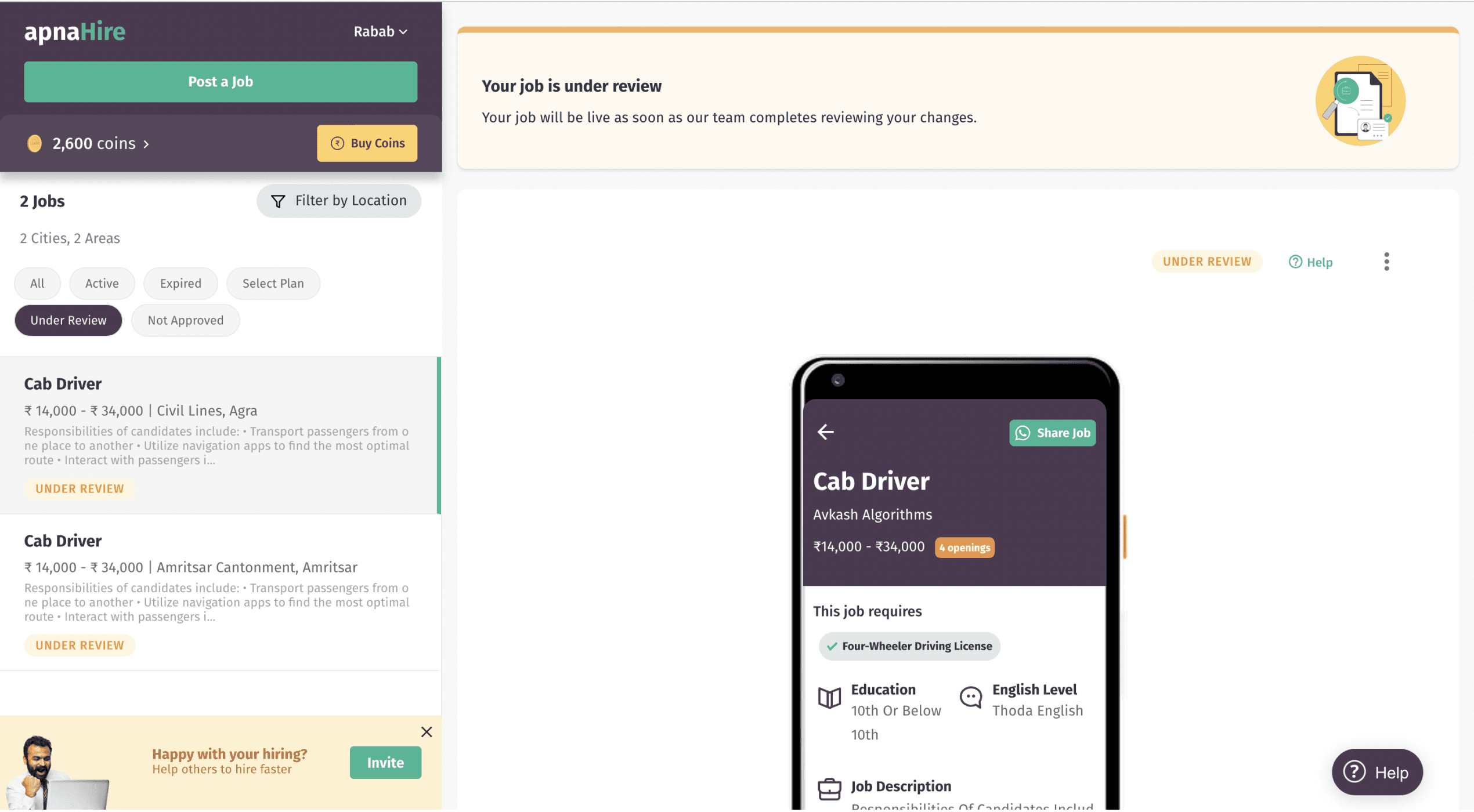
Jobs listing screen

Coins usage details screen
LunchBox logo:
Standard
Favicon
4- point grid system:
4px
8px
12px
16px
24px
32px
40px
56px
72px
88px
Full colour palette
Typeface
9 weights
Larger X-height
Larger open counters
Colour
Level of Accessibility
Outcome
After successfully implementing our common repository in all major flows, we have achieved consistent experience across the product. This also significantly accelerated our product development process by 2x with all new releases.
Development speed 🚀
Increased 2x
Design system adoption rate
80%
Time saving for designers & dev
≈ 30%
Challenge
The main challenge was to create a unified design language and provide tools and assets to designers and developers so that we can achieve consistent experience across product and further evolve it using this assets and guidelines. This design assets would be used by designers everyday so I personally want to build all this without slowing down other business projects.
My role
As a product designer and design systems enthusiast , I was responsible from selling the design system to documentation of guidelines to stakeholders. We have defined the plan & strategy
to design, develop & govern the system and to improve them constantly.
Team credits
Aseem - UX Researcher
Abhishek - Product designer
Sanjeev - Design director
Shyam - Frontend engineer
Harshitha - Frontend engineer
Learnings
Design systems are crucial part of product design & development process. It helps designers & developers focus on solving bigger challenges without worrying much about UI details. Here are few lessons we’ve learned along the way to help you build yours
more efficiently.
Design system is a living document and it is never finished
It was always easy to add to things in the future than to remove, so think before adding something to the system to decrease the complexity, confusion and other headaches.
Design guidelines must not be written in stone. It should be a team’s empowerment and synchronization tool that should be challenged whenever necessary.
Documentation should be created for design systems of any scale. It allows everyone to make consistent decisions, fast and efficiently.
Measuring the adoption of design system is must. It helps in understanding the usage and challenges to add & subtract and iterate on the system.